Design System for Vattenfall's B2B Portals
A project aimed at going from fragmented interfaces to a unified design standard. A design system that creates clarity, efficiency, and better user experiences.
Role
UX Designer / Design System Designer
Client
Vattenfall B2B
Assignment
To create a foundational, token-based design system in Figma with accompanying documentation.
Timeframe
Startup and preliminary work during internship + 5 weeks Aug-Sep 2025.
Problems & Challenges
- Inconsistent design and user experience within and between portals in Energy Site Suite.
- Many unique solutions and low design control.
- Vattenfall's official design system is adapted for the web and not for complex portals, so it cannot be used
Result
A foundational token-based design system and UI kit with documentation in Figma that is in use today.
1 - Background:
Vattenfall B2B
About Energy Site Suite
Vattenfall's B2B portals (collectively called Energy Site Suite) are systems used by business customers, energy companies, industrial customers, and internal traders to manage power agreements, monitor consumption, buy and sell electricity, make forecasts, and work with hedging strategies.
These systems were developed by different teams without a shared design system, which resulted in the interfaces varying in both appearance and function. Each portal used different components, colors, and patterns. This created inconsistency in the user experience and made design and development processes inefficient.
As a UX designer, I was tasked with establishing the foundation for a unified and scalable design system. The goal was to create structure, simplify collaboration between teams, and lay groundwork for future development of the portals.
The project started during my internship in spring 2025 and was then extended during fall 2025.
2 - Results:
Results & Deliverables
Token-based design system
Foundational structure for the design system with variables and styles for colors, spacing, and typography that create better control and scalability.
Shared documentation
Documentation for both developers and designers gathered in one place - at the overview level and at the component level.
UI kit
Basic component library: icons, buttons, form elements, and modules that are already being used.
Collaboration
Started collaboration between portals - a shared direction, and a first framework for how continued development can proceed more uniformly.
3 - Process:
Audit, Identification & Prioritization
Mapping the current state
The project began with an audit of core components to identify where the inconsistencies were most severe. By gathering everything in a clear overview, I could visually demonstrate to teams and stakeholders how fragmented the interfaces actually were. It proved to be an effective way to create alignment, explain the need for a design system, and prioritize which components needed to be standardized first.
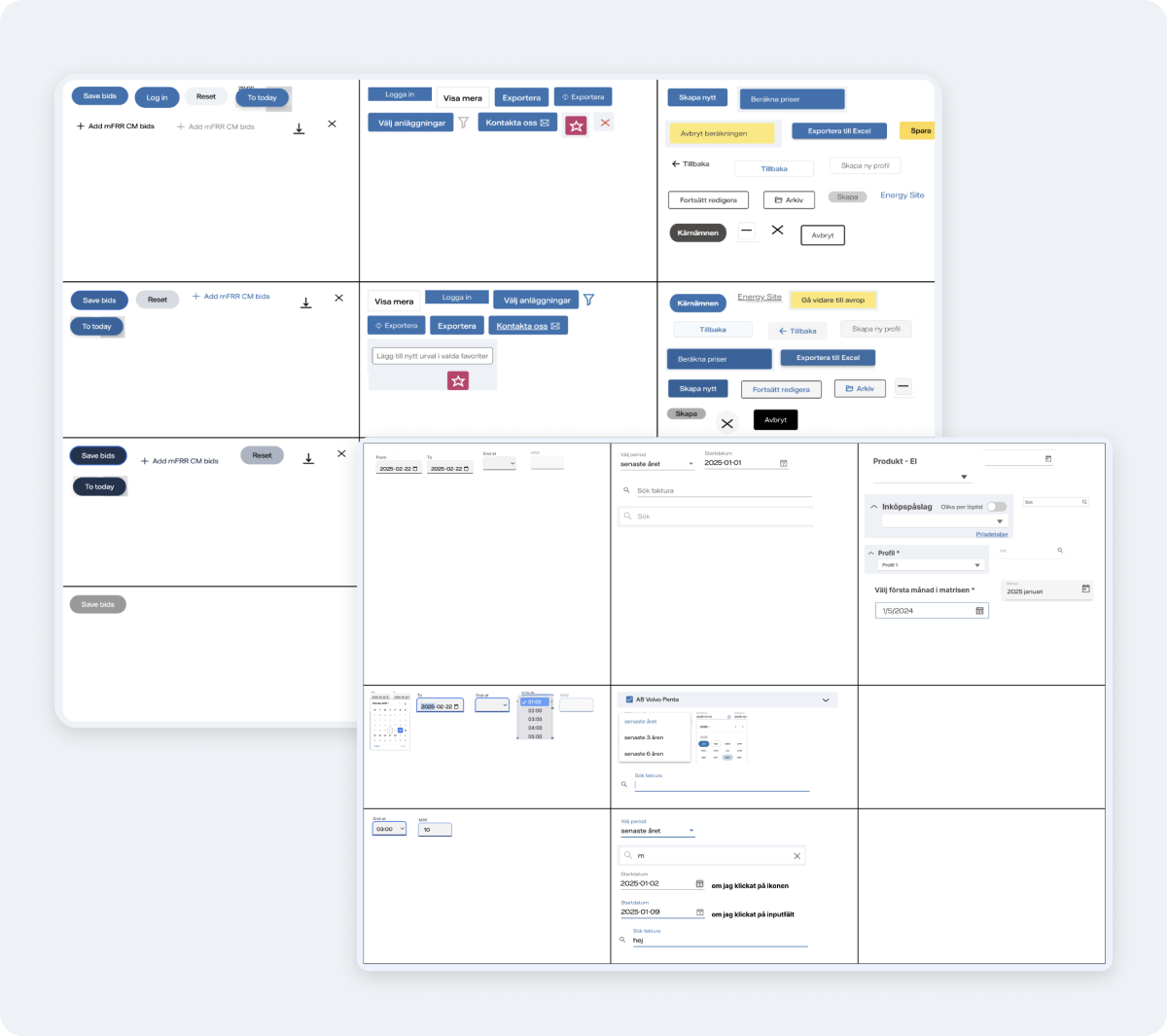
Mapping of unique buttons and form elements - inconsistencies were found both within and between portals
Workshops & Decision Making
Workshops
With insights from the audit, I facilitated several workshops with designers and developers. The goal was to create alignment around the current state, clarify needs, and make collective decisions for the design system work.
Decisions
During the workshops, we decided on components that were most critical to standardize first, based on their frequency of use and impact on user experience. We also decided on design principles and guidelines that would guide our work going forward.
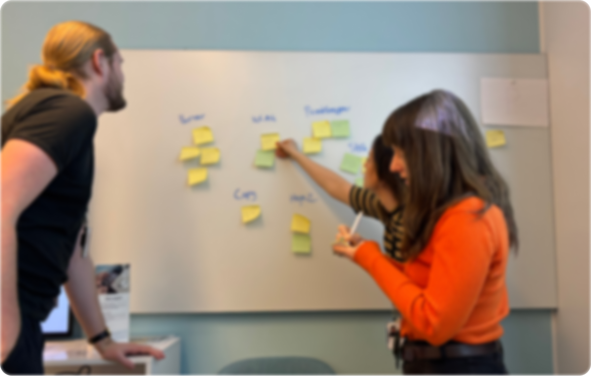
Workshop with designers and developers
Design System Structure
Structure and documentation
An initial structure for the UI kit has been developed where core components, modules, and guidelines are gathered in one place. The purpose is to create a shared foundation for designers and developers, where everything from typography and colors to buttons, forms, and modules is documented, visually consistent, and adapted for accessibility.
By gathering and visualizing available components, it becomes easier to standardize, reuse, and further develop the interface in a unified way. The shared structure makes it clearer how, for example, colors, states, and interactions should function and be used to meet WCAG requirements.
Since developers work in different codebases and languages, Figma is currently serving as the shared place where everything can be documented and shared - a natural first step before the design system is moved into code.
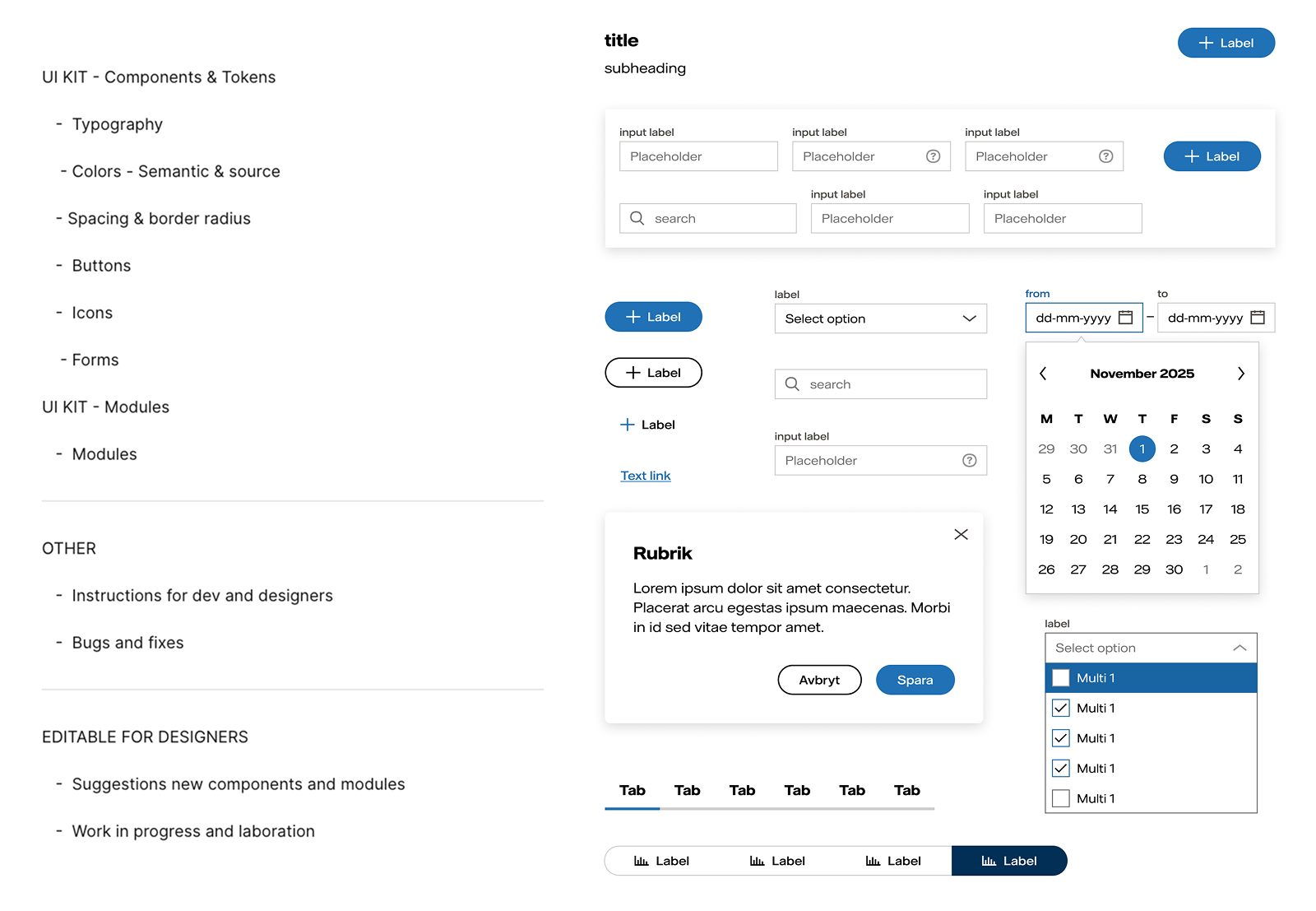
Mapping of unique buttons and form elements - inconsistencies were found both within and between portals
Component building
All components are built to be flexible so they can adapt to different needs and scenarios according to standard principles. The design builds on the official design system but is adapted for the portals.
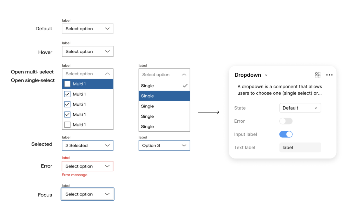
Example of components in the UI kit
Design Tokens and Components
While working on the design system, we discovered that variations in colors, unclear states, and inconsistent components were often due to a lack of foundational structure. That's why we introduced a token-based model where colors, typography, and spacing are defined centrally and used consistently throughout the library.
This not only gave us a more unified expression, but also better control over how colors and components are used, which in turn made it easier to ensure that accessibility requirements, such as contrast levels, are met. By handling updates at the token level, they spread in a controlled way to all components, which simplifies maintenance and makes the system both more scalable and more robust over time.
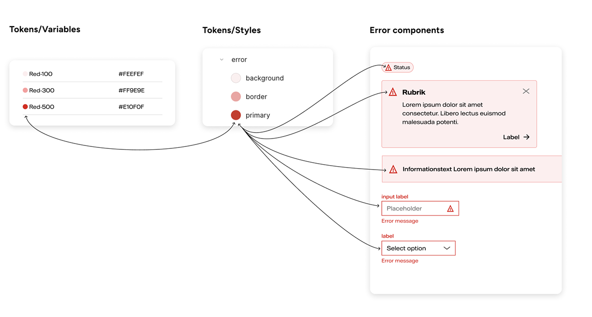
Visualization of the relationship between color tokens, styles, and how they are applied in different error components.
Testing & Quality Assurance
Approach to testing and quality in the design system
While building components and tokens, we tested in parallel to ensure the system held up in practice with realistic scenarios. We established an iterative approach to testing and quality assurance, where components are created, tested, and adjusted in multiple cycles. The work involved continuous alignment around naming, implementation, and improvements - to ensure the system works both in design and code, and in real user contexts.
Testing in context
Testing in realistic scenarios and user contexts
Dev + Design collaboration
Alignment on naming, documentation, and implementation
Iterative improvement
Adjustments based on feedback and contextual testing
4 - Summary:
"The goal is not to rebuild everything, but to have a shared truth to start from when we build new things" - shared guiding principle
By establishing a scalable and living design system, I created the conditions for a long-term and more sustainable way of working. Now there is a shared design foundation that can be developed, improved, and built upon over time.
Insights & Learnings
Workshops as a method and tool
It was challenging to take the leap, but I've really seen how effective workshops are for decision-making. They provide structured opportunities for discussion, solution exploration, alignment, and engagement. I used different formats: a half-day on-site but also shorter, focused meetings, adapted based on time and problem type.
Continuously share insights
By creating and sharing the audit early in the process, I gained a deeper understanding of the problems and could clearly see where the inconsistencies were most severe. I realized that I had previously assumed everyone already had a clear picture of the current state, but although many experienced the portals as fragmented, the extent only became clear when visualized in black and white. Concretely showing the inconsistencies created both engagement and a shared understanding among stakeholders and teams - a sense of "now we're tackling this together".
Build accessibility from the start
By, among other things, defining colors at the token level and naming them by use case rather than appearance, we ensure contrast requirements from the start and make it easier for the team to use the right colors at the right time. This reduces the risk of misuse and makes it easier to uphold accessibility standards over time.
More time and tighter collaboration with developers
I had regular syncs with developers, but tighter and more continuous collaboration from the start would have made it easier to find common ground, make more decisions earlier, strengthen quality, and create a stronger shared foundation.