SpeedEats
How do you make a food app feel as irresistible as crispy fries?
Course
UI Design
Challenge
Design UI for a fast food delivery app with focus on "making it sexy" and creating a smooth and pleasant ordering flow.
Use cases
- The spontaneous cozy evening
- The fancy hangover breakfast
- The luxurious weekend brunch
Target Audience?
Someone who wants to cook as little as possible, who likes to treat themselves, and who often thinks "Let's get everything we're craving!"
Timeframe
About 2 weeks
Result
A fast, clear, and visually cohesive design that makes express orders as smooth as butter.
1 - Background:
The Story of SpeedEats
Tänk expressmat som en hybrid av Foodora Market och HelloFresh.
The goal was to create a UI for an app where users could order what they need in the moment and have it delivered in around 10 minutes. No big shopping trips, just immediate needs: "we're out of milk", "need easy hangover food now!", "snack emergency".
Deliveries were enabled by bicycle couriers picking items from small, centrally located warehouses with quick availability and broad selection. To support this, the app needed to be fast, clear, and easy to navigate. Plus, it needed to offer pre-packaged product kits for different situations – similar to HelloFresh, but in express format.
Min uppgift?
My task?
To create the UI design from scratch: typography, colors, spacing, components, and a visual style that makes the experience as smooth as the delivery.
2 - Results:
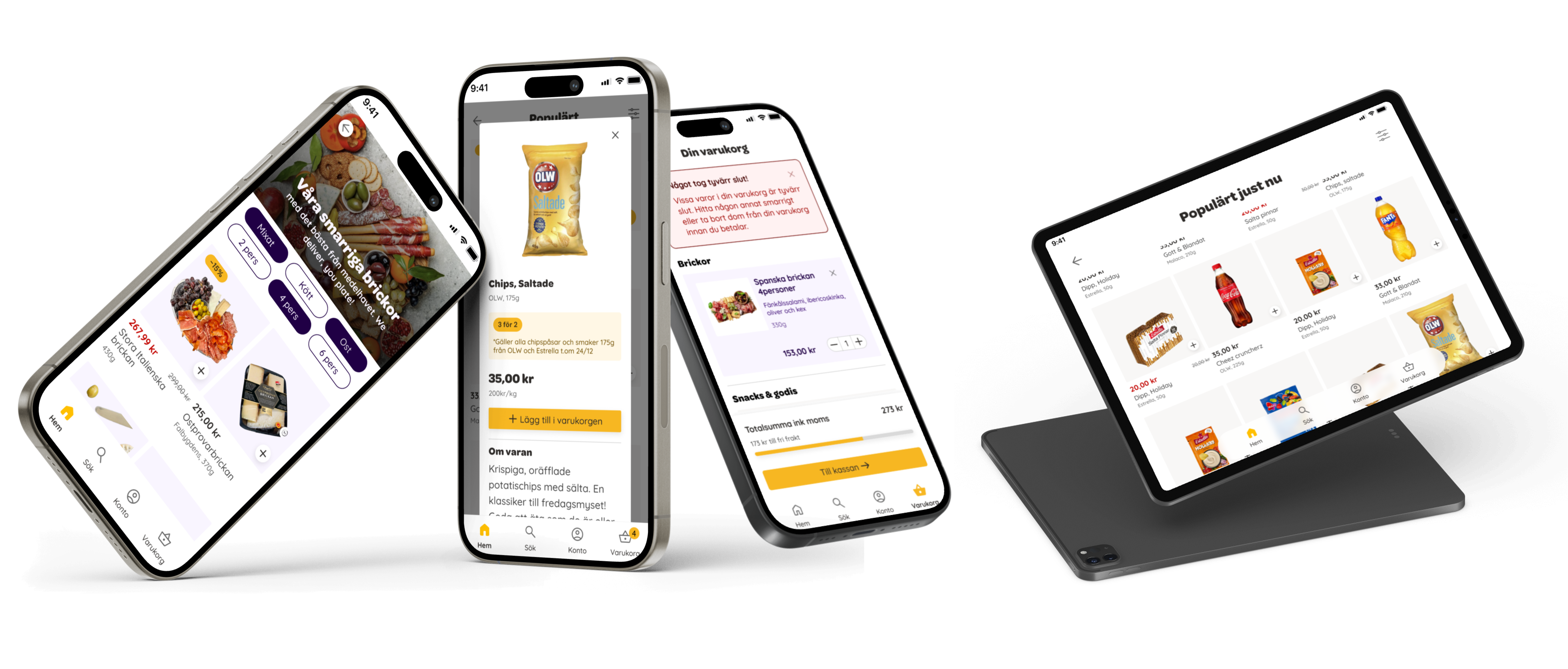
"This is incredibly good design in general! Everything from the indulgent branding through the logo, "the motif" (the dripping fat and the wonderfully subtle fingerprint) and the incredibly tight iconography, continuing with details like "unfortunately sold out", discounted prices (in red), complementary products that fit the specific moment, and so on. Fantastic work!" - Course Instructor
SpeedEats
Smooth, Luxurious, and Indulgent
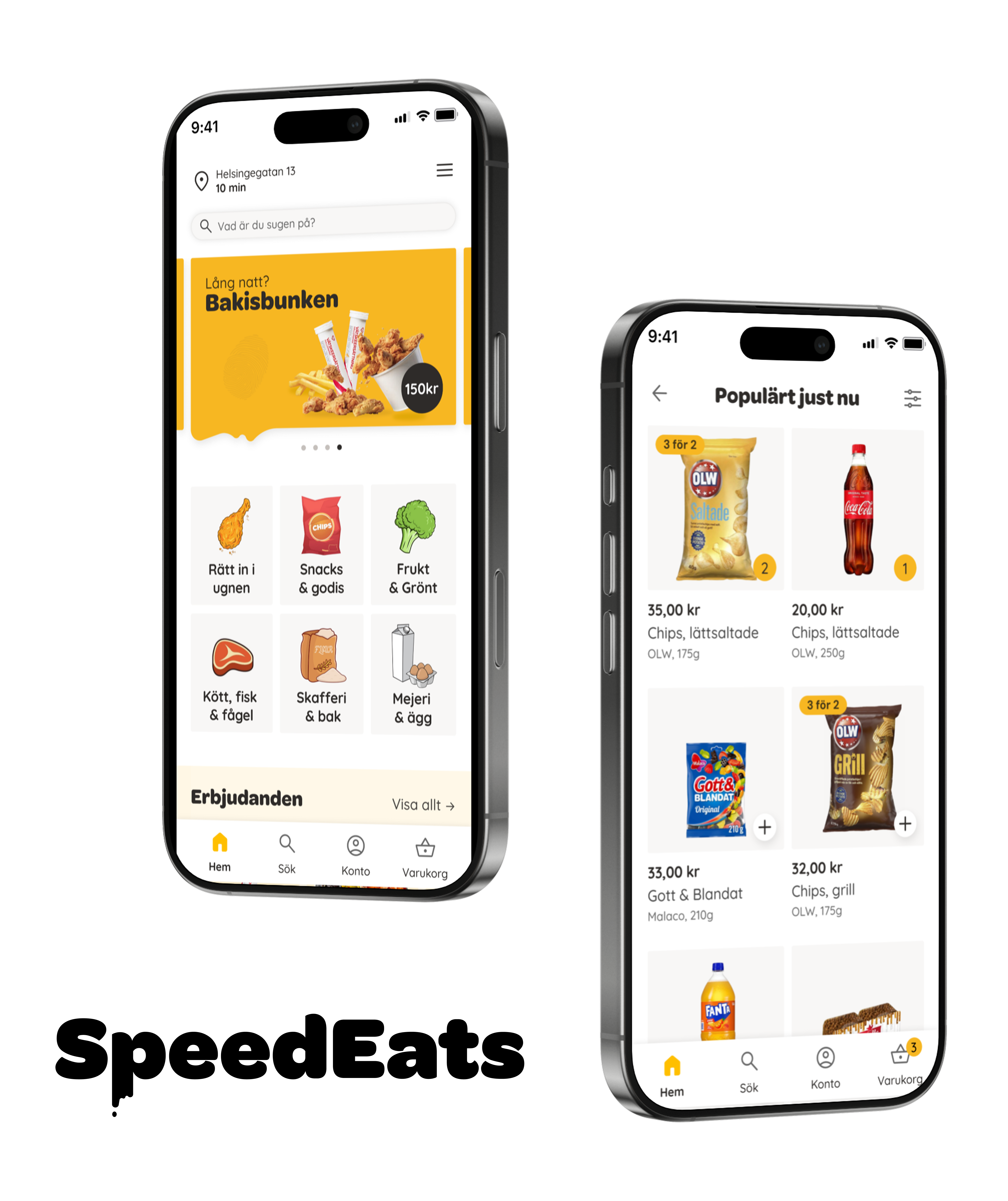
SpeedEats is a UI concept for a fast food delivery app designed for quick, spontaneous needs rather than planned shopping. With a focus on clear flows, strong visual hierarchy, and a playful expression, the app makes it easy to go from "hungry" to "ordered" in just a few clicks. The result is an experience that embraces the indulgent side of fast food - smooth to use, luxurious in feel, and just the right amount of indulgent.
3 - Process:

The Making of SpeedEats
From wireframes to cheesy express magic
The work started with existing wireframes, which meant that focus early on was on expression, hierarchy, and visual unity. From the start I had a clear idea that the app should feel like a place for a little "indulgent" food: something quick, delicious, and maybe not entirely well thought out.
That feeling guided the branding. I wanted the expression to be soft, warm, and almost a bit cheesy, which led to choosing a yellow primary color combined with bulbous, round, and soft typefaces.
With the wireframes as a foundation, I also looked at similar food apps for inspiration around structure, navigation, and visual hierarchy. I started by designing one view at a time and set up a clear component structure in Figma early on, which made it easy to iterate, reuse patterns, and scale the design to the remaining views.
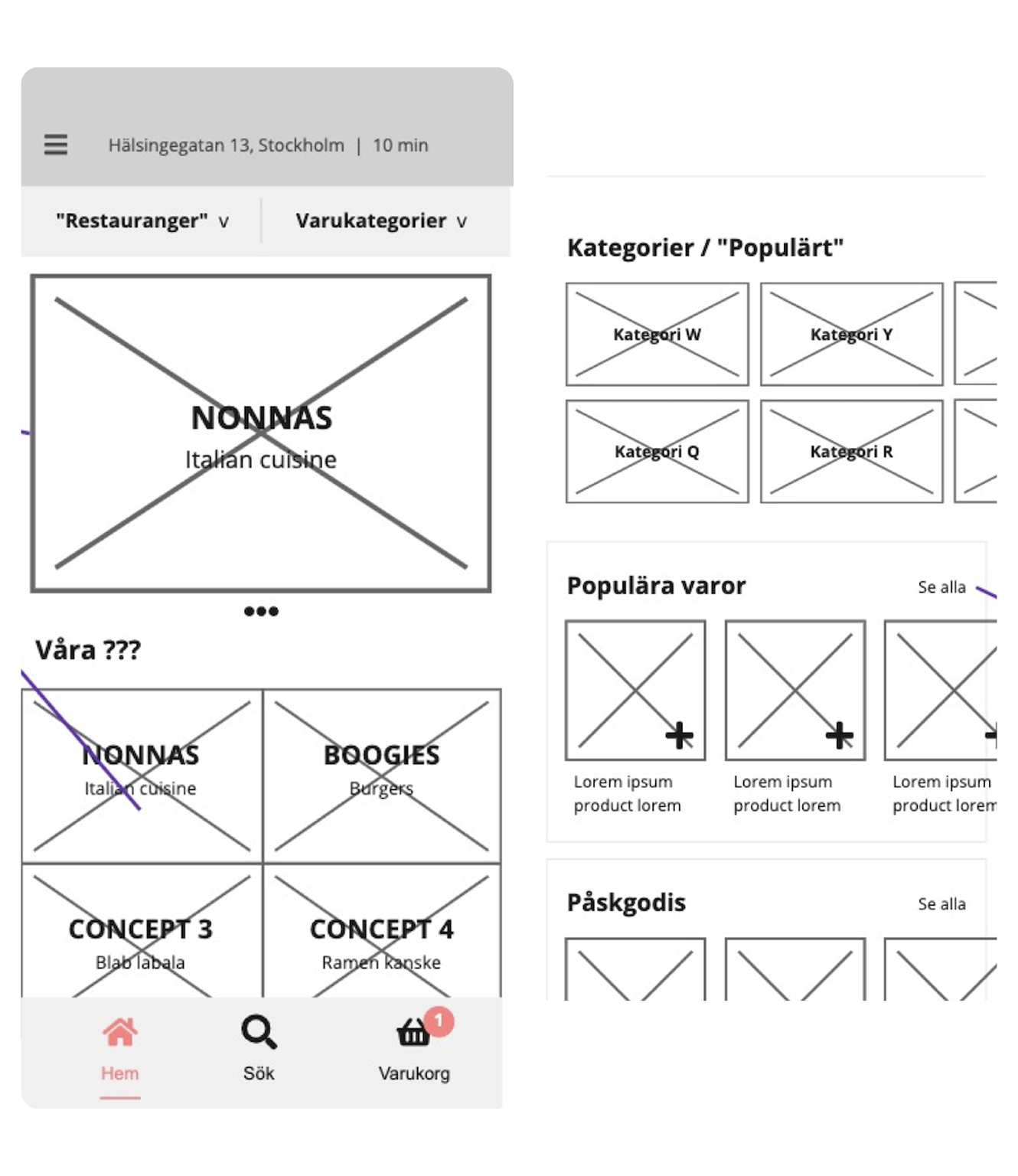
1. Start from existing wireframes
Why reinvent the wheel? I had wireframes to work with, which allowed me to focus entirely on the visual language and UI components.
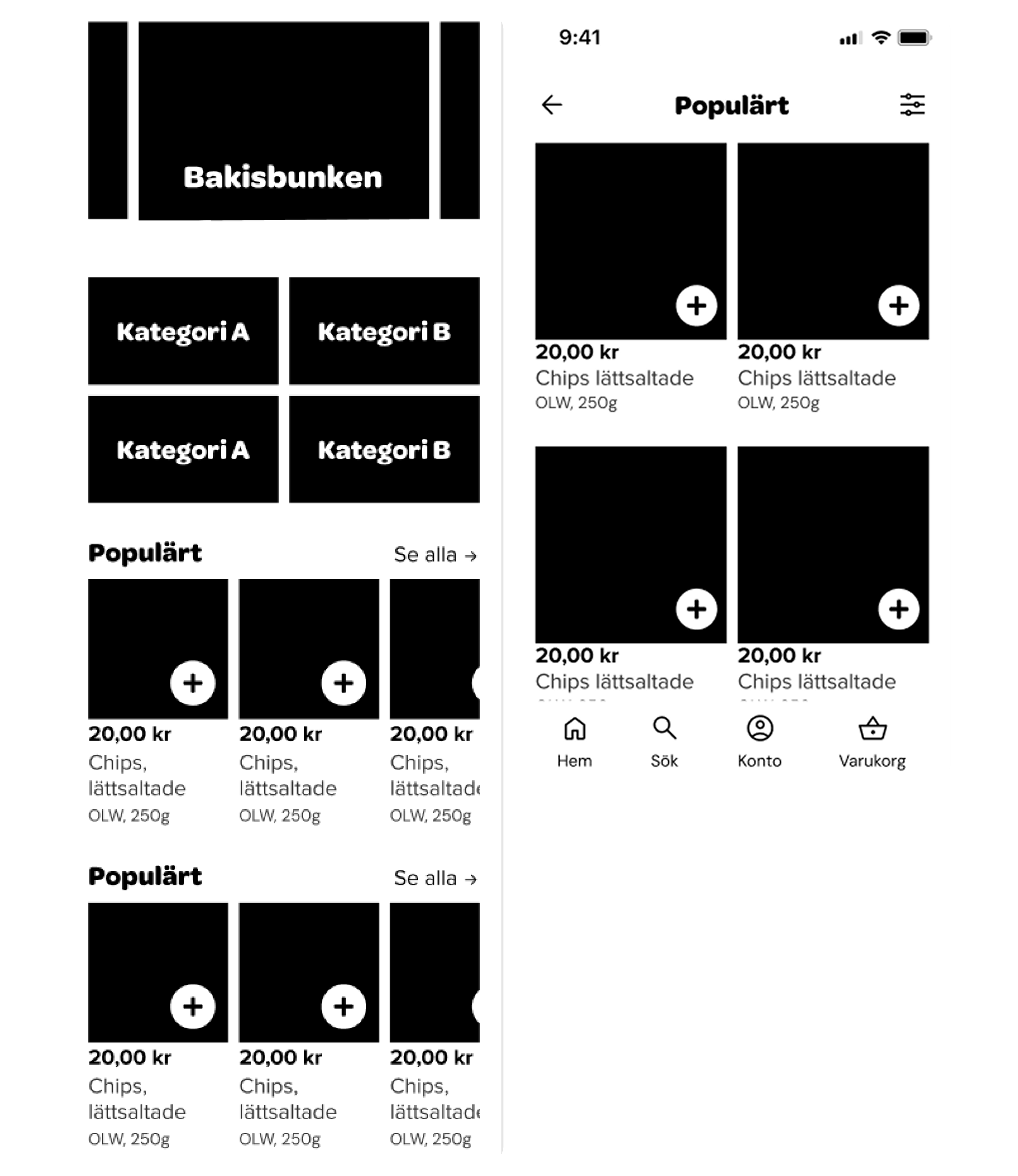
2. Draw and sketch layouts
In Figma I sketched different layouts and component placements to quickly explore different visual hierarchies and flows.
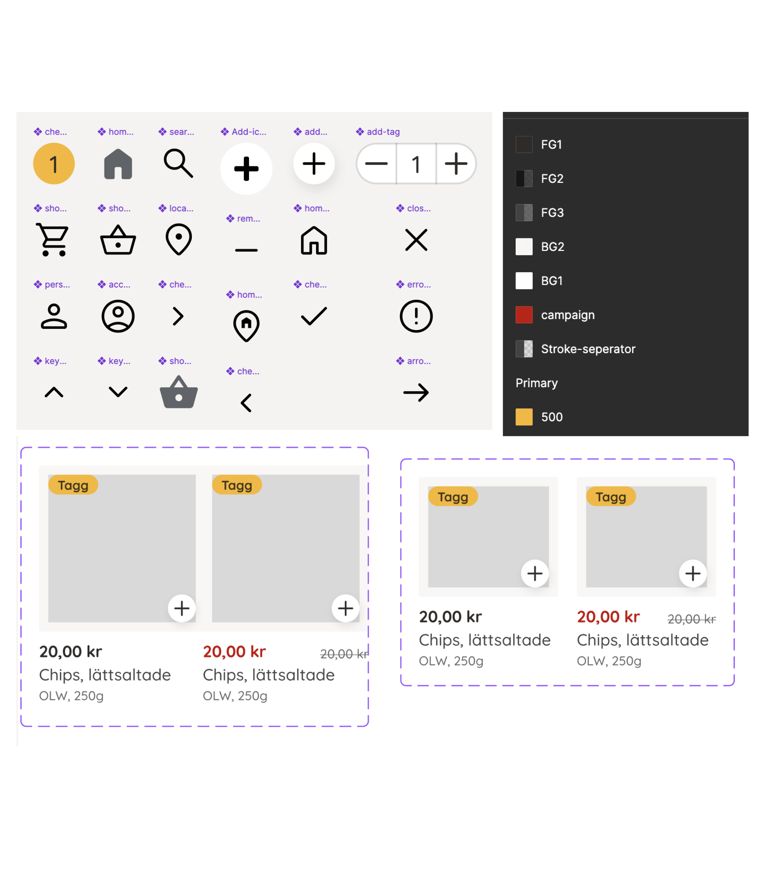
3. Systematize and iterate
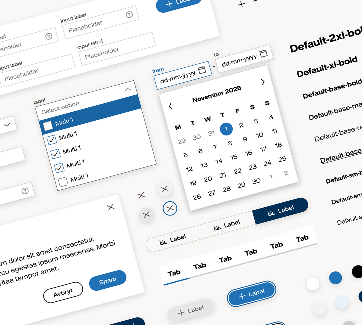
Structure for colors, icons, and components in Figma that I could reuse and iterate on throughout the design process.
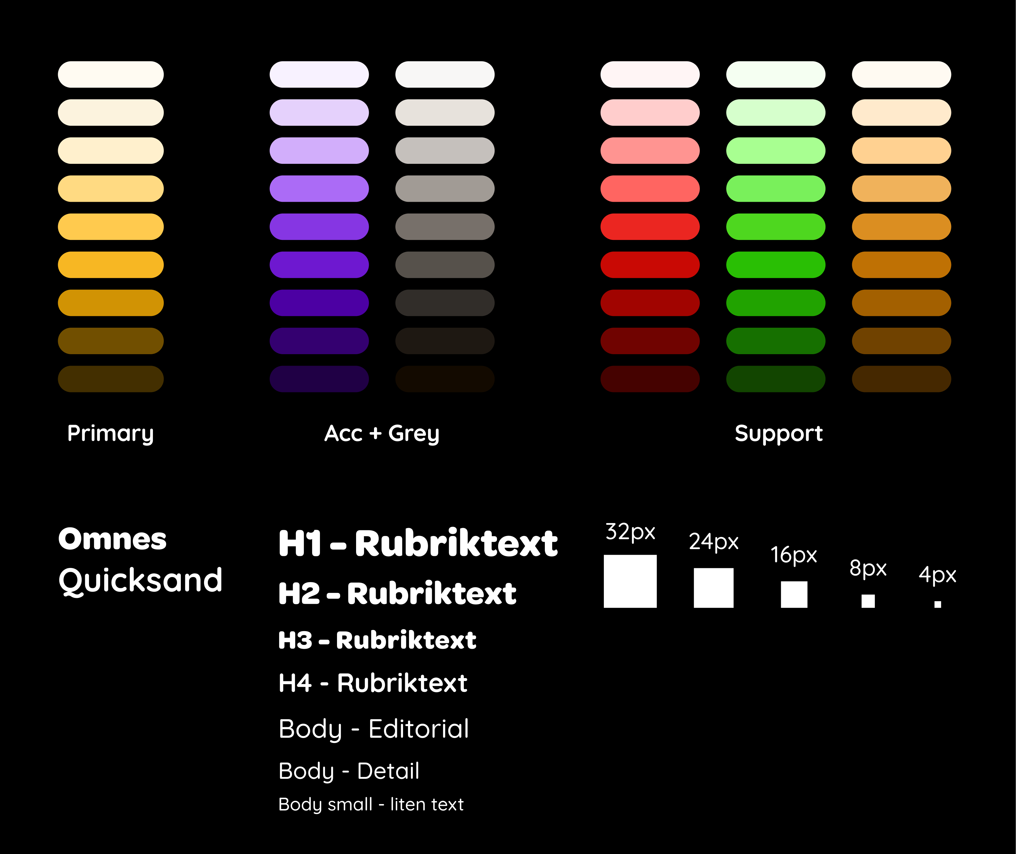
Colors, typography, and spacing scale that reflect the brand and that constrain design choices.
4 - Summary:
Insights & Learnings
Clear branding provides direction
Having a clear picture early on of what the app should be and just as importantly, what it should not be - made design decisions easier throughout the project. This was an incredibly fun case where I felt free in my interpretation of the task. The concept and keywords indulgent, luxurious, and soft served as a throughline and gave the project both momentum and a clear identity.
Structure saves time and energy
Of course, it's important to first sketch freely to explore ideas without getting stuck. But by working more systematically based on UI principles and using tools like components and reusable patterns, I got a lot "for free". A clear structure made it easier to iterate, keep the whole together, and scale the design without compromising quality.